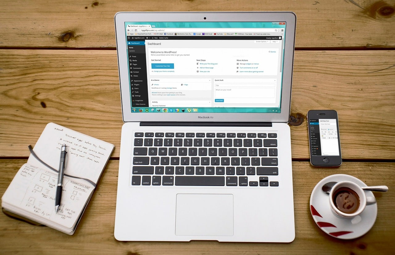
When it comes to creating a website, arguably the most important factor is how well it runs, mainly how user-friendly it is. For example, if a website has poor loading times and outdated information, then the user is likely to click off this and visit a competitor.
It is essential to keep your website up to date, both in information and in updates to software, security, and plugins. However, alongside this, your website should be as user friendly as possible in the design and layout of your website.
To help you create the perfect user-friendly website, I’ve gathered together four quick tips, beginning with a minimalist design.
Minimalist design
When it comes to web design, many users and non-professionals clutter the pages in an attempt to give away as much information. However, this usually backfires on the user, resulting in them clicking off and visiting an alternative site.
Instead, you want to keep your pages as minimalist as you can – this is especially true for your home page.
Ensure your website is mobile-friendly
More and more people are browsing the internet and viewing websites on their smartphones and other smart devices. Therefore, it’s paramount that your website is mobile-friendly and accessible.
There are numerous ways to do this, but working with a professional is no doubt the easiest method, both in saving you time, effort, and in some cases, money.
Navigation is key
When you visit a new website, navigation is key. If a user can’t find the page or post you’re looking for, then they’re not going to stick around. Ensure your search bar works, your toolbar is not cluttered, and that only necessary pages are linked (avoid spam).
Create user-friendly, easy to read content
My fourth and final tip is to create user-friendly content that is also easy to read. You can use plugins such as Yoast SEO to measure the readability of a page or blog post, ensuring your post is understood by all ages and educations.
Similarly, avoid fancy text and text colors, and stick to a standard font such as times new roman, size 12, and black – although you may think other colors look good, the hard truth is that it often doesn’t.
The bottom line
If your website is not user-friendly, you’re likely to lose out on potential leads, sales, and conversions, not to mention repetitive custom.
To find out more about my web design services, or to book a free consultation, click here.


